More of everything: Our new site and Artsonline

If I’ve learnt anything over the last year and a bit, it’s that redesigning a website is never as simple as you think it’s going to be.
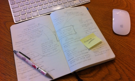
What began in 2009 as a discussion about ‘freshening up’ the website quickly became a more ambitious project. We knew it had got a bit out of control; the more content we’d added the more complicated the navigation had become. Many things were hard to find and it was difficult to highlight new or exciting stuff. The web (as ever) had moved on pretty fast since our last design, the site already looked dated and it didn’t take advantage of bigger and better screens. We were pretty sure that we wanted a site that had more impact, was clearer and easier to navigate and made more sense of everything we do.
Simple.
Before we started we also looked at our analytics to see how people were already using the site and we asked visitors what they thought we could do to improve it. ‘More of everything’ was the immediate response. More, bigger and better images, more and better resources for artists, more articles video and audio clips; about the projects, the artists and the wider arts world.
OK, less simple.
Although we were already producing some of this, including critical writing, video, audio, images and publications from artists’ projects, the blog projects we’d worked on with the youth board, we realised it was hidden in the depths of the site, impossible to browse, search or discover by accident (and sometimes to find at all). It was also something we were already planning to do more in other areas, we were already talking about creating blogs for specific projects and including more documentation and critical writing as part of our bursary programme. Including a space for this content became part of our plan.
We had a lot of discussions, both internally and with web designers Red Leader, to try and create a structure that was easy to navigate and that included everything we do. From this, Red Leader created the designs that formed the basis of the new site, which we were very excited by. So much of the work we produce has an amazing visual presence, we wanted to reflect that in our website. Red Leader had a really creative approach to the layout, creating the grid system that’s used across the site, which resizes depending on the size of your browser window (one of the bits I find it impossible not to play with) and giving us an amazing platform to showcase the projects we work on and the artists we work with.
Finally we created this space, the Artsonline blog, to host some of this exciting ‘other’ stuff – all the content everyone wanted more of. We want this to become a space that can be home to a range of Artsadmin voices, from the artists we work with to our staff and collaborators… and this blog is the start of that process.
The other thing I’ve realised about building a website is that it’s never ‘finished’. We’re not there yet – we’ll be refining the site and adding more content over the next few weeks and months but it would be great to know what you think of the work we’ve done already, and especially what you’d like to see on Artsonline in the future.
(One of the first jobs for Phase II is to add comments here, but in the meantime if you email me any thoughts or questions I’ll try to add / answer them).
